Follow Us
Subscribe to our
Newsletter

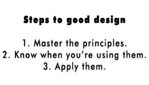
The Four Basic Design Principles
Effective design centres on four basic principles: contrast, repetition, alignment and proximity. These appear in every design.
This article provides a brief overview of the basic principles discussed in this series. Although the companion articles explore each principle separately, they are all interconnected. Design projects rarely apply one principle.
Contrast
When a design uses several elements (e.g., type, colour, size, line, shape, thickness), the goal is to make each one distinct. When elements look too similar, none stand out (left). Contrast allows designers to assign characteristics that set elements apart from each other. The dissimilarity, or contrast, piques people’s interest and draws them in (right). This is the reason contrast is often considered the most important design principle.
Repetition
Repetition helps designers establish relationships, develop organization and strengthen unity.
As this Asian-inspired motif illustrates, any number of elements can be repeated, including:
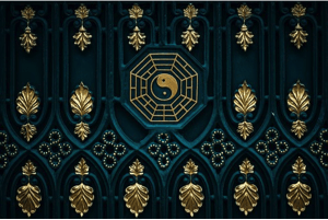
- Sizes
- Fonts
- Shapes
- Colours
- Textures
- Line Thicknesses
- Graphic Concepts
- Spatial Relationship
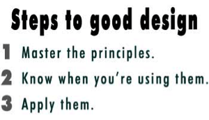
Alignment
Skilled designers never place anything arbitrarily. All elements should relate to all others in some way.

Alignment creates a clean, sophisticated look. In some cases, it can also suggest information hierarchy. Elements out of alignment can be jarring, as with the windows in the bottom row.
Proximity
When items are grouped or appear close together, they become a single visual unit, rather than several separate entities.

Proximity helps organize information, reduces clutter and gives people a clear structure. When looking at this photo of a stained glass window, do you see a series of disjointed shapes, or do you see a series of concentric circles?
Failure to apply these principles
Mnemonic devices, or acronyms, often help people remember concepts. Although perhaps inappropriate, we’d like to impress upon readers how important these four design principles are. Failure to apply them results in … well, we think you get the gist.