Follow Us
Subscribe to our
Newsletter

Proximity:
Sound Design Close to Your Heart
There’s a tendency among inexperienced designers to fill every inch of space. It’s unclear why they have such an aversion to empty—or white— space. When elements are scattered everywhere, designs appear unorganized and lack structure. Key information isn’t instantly accessible. This is where proximity can help. One of the four basic design principles, proximity helps to organize information.
In looking at this business card, how many times does your eye stop? How many separate elements occupy the design? Where do you begin reading? Where should your eyes move next?

Group related items together: place them close to each other so they’re seen as one cohesive group, rather than as unrelated pieces. Conversely, avoid placing items or pieces of information not related to each other in close proximity of other items.
Placement provides clues into the design’s organization. When items are in close proximity, they function as a single visual unit. Proximity, as you can see this redesigned business card, implies a relationship.

Consider these two menus. How many separate elements are there?
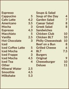
When looking at the first example, do you naturally assume all of the items have something in common? If you had to judge by their placement, do any of these elements seem related to each other or different from one another?
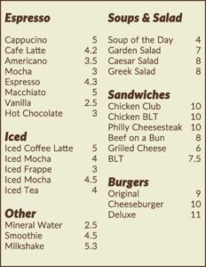
Now consider the second menu. What do the groupings suggest? By grouping similar elements into a single unit, the menu becomes more organized. Audiences understand instantly —whether they’re aware of it or not. Readers understand where to begin reading, and they know when they’re finished.
They understand intuitively because the items in each group are separated from the items in the other groups. Physical closeness creates relationships.
Remember that proximity doesn’t necessarily mean that you must place everything close together. Just as people do, content areas need room to breathe! Closeness—or a lack thereof—indicates whether relationships exist.
Look at the menu examples again. Note the space around the headings. (Psst… This may be a good time to review the use of contrast and repetition to offset important elements and areas of focus.) This “white space” around the letters further reinforces content organization.
When you design something, whether it’s a brochure, poster, newsletter or business card, you already have a sense of how to organize the various pieces of information. You understand how they’re logically connected. You know which content should be emphasized and what doesn’t need to draw audiences’ attention. You can express this graphically. Proximity is your friend: keep this principle—and the others discussed in this series —close to your heart.